That said, here is a small favorite:
Giant-Size Doc Savage, 1975
Writer: Steve Englehart; Plotter (part One): Roy Thomas
Penciller: Ross Andru; Inkers: Jim Mooney and Ernie Chua
Writer: Steve Englehart; Plotter (part One): Roy Thomas
Penciller: Ross Andru; Inkers: Jim Mooney and Ernie Chua
This comic is in the shortbox for only one reason. It's not the story concept, which seems to have suffered from a little "mission drift": you can never really tell if the intent was updated version or a traditional version of the classic thirties pulp characters. I mean, Monk has sideburns and wears bell-bottoms, yet Ham flies to Washington DC from New York in an autogyro; Doc still rides on the running board of his roadster, but the police cars they pass look like seventies sedans; the bad guys communicate with portable TV units, but Doc and the crew fly to Hidalgo in a prop plane. Even accounting for "advanced" technology on the part of the protagonists, it's hard to tell what's up, and I can remember thinking 30 years ago that Roy Thomas had changed his mind mid-production about what they were doing; I am sure the tepid movie tie-in influenced that.
The plot and action are not the draw, either. It read to me more like a Doc Savage primer than an actual story adaptation: here's Monk and Ham squabbling; here's Renny putting his fist though a door; here's Doc hypnotizing someone with his gold-flake eyes. Granted, the original stories were pretty much schematics anyway (I think Steranko listed Lester Dent's all-purpose plot outline in his History of Comics), but this comic doesn't present an interesting take.
The art doesn't excite either. I consider Andru one of the stalwarts of the Bronze Age, but this issue looks rushed, and the inking is muddy, and the printing looks like it was photocopied.
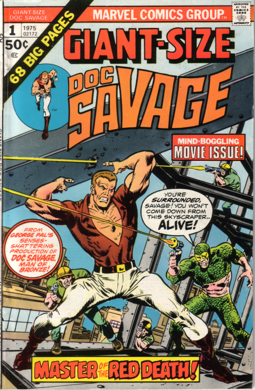
No, I think the only reason this comic hasn't gone away is that I find the Buscema cover totally compelling: with fine, clean art and great composition, it's paradigmatic of what covers used to be like. And I guess that's all it is.
Side note: The Doc Savage property has bounced around between comics houses several times. Shortly after this, it moved back to DC for a mini-series by the Kubert boys. (That version was a little disappointing, too.) Before the series came out, DC ran a house ad showing a dark-haired Doc with a ponytail, wearing Chuck Taylors, fiddling with a gun. Does anybody have a comic with is ad in it? I'd love to see it again. While the concept was never executed in the mini-series, I can still remember the heated discussions it raised among my pulp-loving pals.


